CommArts Design Trends
February 27, 2009
I’m pleased to be one of three creatives that Communication Arts magazine queried for their January/February issue’s Design Trends column on newstands now. The question was: Where do you get your color inspiration? My answer:
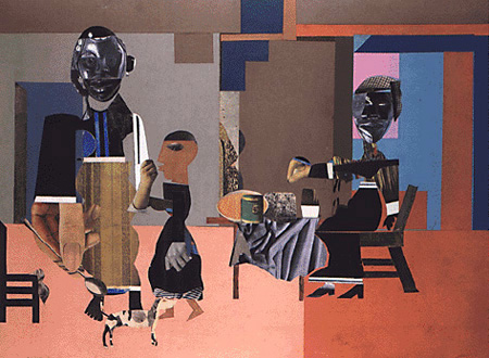
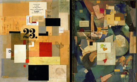
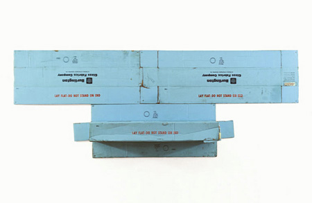
“I get my color inspirations from collecting paper. New and surprising color combinations appear amid random piles of dyed paper, scrap paper, aged paper, printing paper, and packaging paper when my studio’s messy enough. For added excitement, I turn to Kurt Schwitters’ collages, Robert Rauschenberg’s cardboard assemblages, and Romare Bearden’s Illusionist at 4 P.M., from 1967. Pink, blue and brown never looked so good together.”
Here are the images I was referring to, which didn’t run in CommArts due to space limitations:
Two of Kurt Schwitters’ many brilliant collages and assemblages that I never tire of are Mz 601 from 1923 (left) and Merz Picture 32 A. The Cherry Picture from 1921.
Robert Rauschenberg’s 1971 cardboard pieces derive power from their monochromatic palettes. I find this baby blue assemblage titled Volon particularly irresistible.

This is Romare Bearden’s Illusionist at 4 P.M., a composition of various papers with appropriated magazine photos. I’d loved to have seen Bearden’s process of creating this adventurous palette and arranging the flat color to create the illusion of space.

